The @-symbol, part 2 of 2

Handpicked

I almost forgot to link to the second part of this great piece by Keith Houston on his Shady Characters blog. Part one is here.

Though the origins of the ‘@’ symbol’s visual appearance are murky at best, its use as a shorthand for ‘at the rate of’ is rather better attested. One scholar in particular saw his work reach a far wider audience than might have been expected of an otherwise minor piece of paleographic research: in 2000, a number of newspapers reported on the work of one Giorgio Stabile, an Italian academic who had finally unearthed convincing documentary evidence of the symbol’s meaning, if not its visual appearance.

Stabile’s search for the birth of the ‘@’ started with an analysis of the symbol’s various names. A online survey conducted in 1997 revealed that the symbol went by a multitude of names across 37 different countries, many of them playfully inspired by its shape […]. French and Italian have both ‘proper’ terms — respectively arobase, an archaic unit of weight, and anfora, or ‘amphora’ — and also the more whimsical escargot and chiocciola, both meaning ‘snail’. English uses the cheerlessly direct ‘commercial at’ or, simply, the ‘at sign’.

Stabile observed that despite the symbol’s many metaphorical aliases, only certain names stood out as unrelated to its shape: the English ‘commercial at’, the French arobase (also rendered in Spanish and Portuguese as arroba), and the Italian anfora, or ‘amphora’. ‘Commercial at’ evidently described the character’s typical usage, but arobase/arroba and ‘amphora’ bore further investigation.

Source: Shady Characters » The @-symbol, part 2 of 2.

Why I still prefer Tweetie 1.2.8 over the official Twitter for Mac

Software

They say that you never forget your first love. Well, in the microcosm of Twitter clients, the old saying has proven true for me. Tweetie has been the first (and for a long time the only) Twitter client I used. At a certain point, all the talk about a forthcoming ‘Tweetie 2’ raised my expectations. Tweetie is fast, well-designed, easy to navigate — I said to myself — it can only get better from here.

Imagine my disappointment when finally Tweetie 2, or rather the official Twitter app for Mac, was released. As I already explained in this article, the main reason why I haven’t switched to Twitter for Mac is its exclusive use of the Twitter-sanctioned t.co URL shortening service. However, I have to slightly revise a brief observation I made in that article regarding Twitter for Mac’s interface. I wrote:

Most complaints [about the app] seem to be interface-related. Not mine. In fact, I really haven’t got any problem with Twitter for Mac’s interface. I don’t mind its non-standard GUI elements, I don’t mind its animations or their inconsistencies.

While this still holds true considering Twitter for Mac on its own, recently I put the old Tweetie and the new Twitter side by side, and I have to say that I like Tweetie 1.2.8’s interface more. Disclaimer: I now use Tweetie with a ‘re-skin’ customisation made available by Yummygum Studio some time ago (it’s available on Iconpaper), but since it doesn’t change Tweetie’s interface drastically and only improves what I already liked, I still think it’s a valid comparison.

Tweetie and Twitter for Mac

Left: Tweetie 1.2.8 — Right: Twitter for Mac

Now, these are very personal impressions, but here goes:

• Tweetie visually separates each tweet from one another, and the author’s avatar from the tweet, and my eyes find that more pleasing than Twitter’s all-white timeline where each tweet is barely separated by a light 1px line.

• Tweetie uses Lucida Grande as main font, which I find more legible than Helvetica at that size.

• I prefer Tweetie’s always-on tab design.

Feature-wise, here’s what I like about Tweetie:

Tweetie General preferences

Tweetie can display users’ full names, while I find mystifying that Twitter for Mac still lacks this feature. I don’t know you, but I prefer reading people’s full names in my timeline.

Tweetie, most importantly, lets you choose among 5 URL shorteners. In Twitter for Mac there’s only t.co, so you don’t even have a drop-down menu to choose from.

Tweetie Advanced preferences

Tweetie’s ability to preview short URLs is also welcome. Twitter for Mac is sorely lacking in this regard — again, mysteriously, since I assume it derives from Tweetie, so I don’t understand why certain features have been dropped. Being able to preview short URLs is handy and user-friendly.

After Twitter changed the authorisation method, Tweetie cannot handle direct messages anymore. If it could, and if Twitterrific for Mac weren’t so awesome, Tweetie 1.2.8 would probably be still my main Twitter client.

Twitterrific 4.3

Software

When yesterday I launched Twitterrific on my Mac, the application greeted me with an update notification. I updated right away because in the list of new features my eye immediately caught this:

• Improved t.co and Twitter picture handling

And as soon as I relaunched Twitterrific, I found out that this improvement does exactly what expected.

As you know, if someone you follow posts an image in a tweet using the canonical Twitter app for Mac, the image link will be wrapped and obscured in a t.co link. As I complained a while ago, with Twitter’s own t.co service all links are created equal, and you can’t know at a glance if they’ll point to an image or an article on another site. It’s unnerving because most Twitter clients can display images inline, and I hate when clicking a t.co link forces me to open a new tab in the browser only to discover that it was a twitpic or yfrog link that the client could have handled internally. With the 4.3 update, Twitterrific recognises whether a t.co links hides an image and if it’s the case, it will display said image inline. I am deeply grateful to the Iconfactory guys for this.

Which isn’t even the best feature of this update! From the Iconfactory blog:

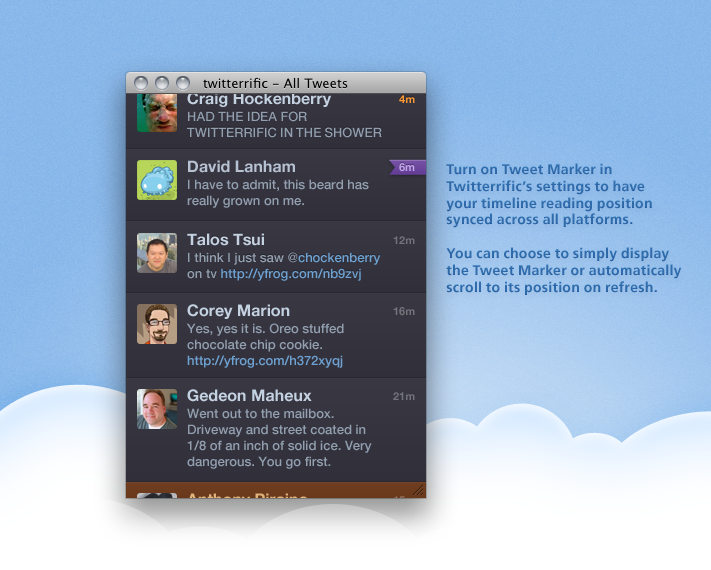
Version 4.3’s best feature is the ability to sync your reading position across all versions of Twitterrific by using the Tweet Marker API. Twitterrific keeps track of where you are in the timeline and displays that position as a bookmark on the tweet’s timestamp. Twitterrific can also automatically scroll to this position – no more searching for where you last left off. This makes reading your timeline a breeze when moving between Mac and iOS during the course of a day. Turn on timeline syncing via Twitterrific’s settings.

Some of the notable highlights in Twitterrific 4.3 include:

  • - Syncing of timeline positions across all versions via Tweet Marker
  • - Improved t.co and Twitter picture handling
  • - Support for displaying Camera+ images inline
  • - Support for normal tweet notifications with Growl (Mac)
  • - Refinements to full screen mode & scrolling in Lion (Mac)
  • - Improved handling of errors associated with incorrect time & time zones
  • - Plus more – iOS / Mac

Most of the kids are alright

Handpicked

Source: Rosamicula — most of the kids are alright:

What these riots — which aren’t demonstrations, but parties got out of hand, with fires and prizes — is the degree of alienation from their own communities, their inability to acknowledge that they are part of any community. They also don’t see themselves as angry or even oppressed, because they cannot look beyond the circumstances they are in and the peer pressures around them. And it is about bad parenting, to the extent that when the 13 to 20% become parents they have no aspirations or responsibilities for their children to inherit. That won’t change if you treat merely them as victims, and enhance their sense of entitlement to trainers and TVs, nor if you treat them merely as criminals and process them through a judicial system that encourages recidivism.

Si è davvero di parte?

Mele e appunti

Oggi più che mai è difficile entrare nel dibattito tecnologico e gestire la variabile Apple senza sembrare di parte. Che si sia a favore o contro, appena si parla di Apple si finisce inevitabilmente etichettati. Lasciatevi sfuggire una frase come “Secondo me l’esperienza utente è superiore e più piacevole sull’iPad”, ed ecco che sarete subito chiamati fanboy. Chi è utente Mac di lungo corso come il sottoscritto, è abituato a certe dicotomie. Negli anni Novanta e Duemila furoreggiavano simili discussioni fra utenti Pc Windows e utenti Mac. La Apple di vent’anni fa però non aveva la prominenza di oggi, era l’outsider dalle idee brillanti ma incompreso, il suo era un mercato di nicchia, così di nicchia che non passavano due settimane senza che giungesse la solita voce di corridoio secondo cui Apple era ‘sull’orlo del baratro’ e avrebbe chiuso bottega da un momento all’altro.

La Apple di oggi scoppia di salute e a ogni suo minimo movimento, sul Web e nelle reti sociali si scatena il dibattito, quel dibattito sempre polarizzato a cui accennavo poco sopra. Sin da quando mi sono accorto che la tecnologia non era un interesse passeggero, ho cercato di affrontare qualunque dibattito portando una posizione il più possibile bilanciata. Se c’è da mettere a confronto dei prodotti e delle soluzioni, cerco sempre di provarli tutti personalmente prima di esprimere un giudizio.

Le cose si complicano nel mondo mobile, di smartphone e tablet, in questi ultimi anni esponenzialmente cresciuto, inevitabilmente preponderante e continuamente davanti ai nostri nasi. In questo mondo il dibattito è molto più scomodo in quanto Apple gioca un ruolo così importante che non è possibile ignorarla, e risultare obiettivi è un lavoraccio. Dire che iPhone e iPad sono, nel complesso di hardware e software, i prodotti migliori delle loro rispettive categorie può a tutta prima sembrare una posizione di parte, ma è davvero così?

Dalla presentazione di iPhone all’inizio del 2007, Apple ha indubbiamente rivoluzionato il mercato dei telefoni cellulari: questo non lo si nota tanto nelle vendite di iPhone, pur straordinarie, ma dal fatto che prima di iPhone l’usabilità di un cellulare era sostanzialmente un misto fra una calcolatrice e un cercapersone, e l’idea più vicina a un’interfaccia touch era quella di usare uno stilo grande come uno stuzzicadenti su schermetti piccoli e poco luminosi. Uscito l’iPhone, tutta la concorrenza è saltata sul carrozzone e guarda caso in tempo record ogni costruttore di smartphone aveva in catalogo la sua personale imitazione di iPhone. A cinque anni di distanza, nessuno ha ancora sfornato un prodotto con la medesima reattività, con la medesima integrazione hardware/software, con un’interfaccia altrettanto ben congegnata. HP/Palm è molto vicina, a mio avviso. webOS è un sistema operativo elegante e con tantissimo potenziale. Merita menzione anche Microsoft, che per una volta ha portato freschezza e originalità in Windows Phone 7. Android non ha ancora raggiunto l’usabilità di iOS. Sono tutti ottimi tentativi, il problema è che iPhone era già più che utilizzabile sin dal primo giorno, 5 anni fa.

Con iPad il discorso è analogo, se non ancora più marcato. Prima di iPad il mercato dei tablet era pressoché inesistente, e quel poco hardware che veniva prodotto aveva tutta l’aria di essere una prova concettuale più che dispositivi fatti e finiti. E ovviamente non c’era traccia di interfaccia multi-touch. L’anno scorso Apple presentava iPad e, dopo il classico giro di interventi da parte di sapientoni che ne pre-determinavano l’insuccesso e l’inevitabile flop, quando il dispositivo ha cominciato a vendersi come il pane, la concorrenza si è impegnata a far uscire la propria idea di iPad. A qualunque costo e a prescindere dal livello di rifinitura. Al punto che, come ha scritto Harry McCracken parlando del Playbook di RIM, stiamo entrando nell’era dell’hardware beta. L’importante, per la concorrenza, è sfornare un tablet che possa competere con iPad, e poi promettere ai clienti che certe funzionalità saranno introdotte in seguito. Alle persone normali, però, interessa che un prodotto che costa qualche centinaio di Euro funzioni bene sin da subito.

A fare l’osservazione giusta è ancora una volta John Gruber:

Questi non sono tablet ‘beta’, sono pessimi tablet, punto e basta. È vero che il loro hardware sembra più vicino alla qualità dell’iPad rispetto al loro software, ma migliorare il software è la parte più difficile in prodotti come questi. Quando RIM avrà rilasciato quel paio di aggiornamenti software cruciali, l’intero mercato sarà cambiato. La verità è che Motorola, Samsung e adesso RIM hanno prodotto degli aspiranti concorrenti di iPad che impallidiscono a fianco di iPad. È così difficile ammetterlo?

Come per iPhone, con iPad siamo già alla seconda generazione del prodotto, e la concorrenza non è ancora riuscita a produrre un dispositivo che offra la medesima esperienza d’uso da subito, fuori dalla scatola. A me, che ho provato di persona questi altri dispositivi, non sembra affatto un’osservazione di parte.

-§-

(Nota: Questo articolo è originariamente apparso sul numero 85 di iCreate magazine nella mia rubrica ‘Appunti’. Se lo ripubblico qui non è per mancanza di idee o di materiale; semplicemente, ho pensato che valesse la pena pubblicare le mie osservazioni in rete così da raggiungere un pubblico più ampio).