

A few days ago, like everybody else with a modicum of interest in tech, I saw the Apple event Surprise and Shine where they introduced the new iPhone 18 Pro and Pro Max, the new iteration of AirPods, Apple Watch, and then the One More Thing — the iPhone Duo.
[Quick aside before going on: maybe it’s because Steve Jobs’s Apple was better at keeping secrets (except for that unfortunate iPhone 4 situation), but only during Jobs’s tenure these One More Thing moments in keynotes really surprised me.]
As usual during these bland, over-rehearsed, over-produced, pre-recorded, sleep-inducing Apple events, I tend to jump over on Mastodon and let my snark flow while I live-microblog. The iPhone Duo segment got a bit of my attention back. I hadn’t read any rumour nor seen any rendering predicting the shape and look of this device prior to the official event. I looked at the iPhone Duo with fresh eyes.
And I’ll tell you this, without irony: I really like the iPhone Duo. I like the hardware, the form factor, the construction, and how Apple has adapted iOS to work on this specific iPhone.
The pricing is ludicrous, of course. Watching all the YouTube tech influencers I still have a bit of respect left for, all saying It’s less than I expected, made me chuckle. If you didn’t know the price, you would think for a split second that it’s even an affordable device. Nah, fool, it ain’t. And I’ll tell you all the prices of the Duo here in Spain:
| Storage | Price |
|---|---|
| 256 GB | €2,339 |
| 512 GB | €2,589 |
| 1 TB | €3,089 |
| 2 TB | €3,839 |
But, believe it or not, what makes the iPhone Duo unappealing to me is not the price. It’s not my diminished trust towards Apple as a company. It’s not even the fact that I’m slowly but surely abandoning the Apple ecosystem and don’t want another device that’ll pull me back in.
It’s that the iPhone Duo is an empty device, conceptually. It’s just another foldable. It’s a very well-made foldable for sure. But — like all the other foldables preceding it — simply restates the fundamental idea. You carry a smartphone that can unfold and become a small tablet, to give you a bit more screen real estate for unitasking, or the ability to run two apps simultaneously side by side, and interact between the two if needed. That’s mostly it.
For most foldables, this distinctive feature — a display that folds and unfolds — has also been its weakest point. The display doesn’t unfold perfectly. The area is unified in software. You see and interact with a single screen that’s double the size of the device when folded. But the area across the hinge is delicate. The crease, usually visible or at least somewhat perceptible. These past years many of the premium foldables have iterated on this pain point, making better hinges, using more robust materials, inventing new solutions to prevent dust from accessing the most delicate parts. They all did a great job at perfecting this. Apple did an amazing job considering it’s their first foldable.
But that display folding in the middle remains a background process in your mind as you open and close and open and close that expensive foldable smartphone dozens of times every day. How long is it going to last? And if I drop the phone in a certain way? Will the protective case help? What if the phone lands unfolded and face down? Will a scratch or a nick be enough to start an irreversible fate down the road?
The foldable phone category has always left me a bit perplexed. Flip phones, less so. I’m more of a guy who’d like a smartphone that becomes even smaller by flipping close, rather than having to carry an iPad mini that folds into a still-large smartphone. I’m not saying foldables are useless devices — I can see their appeal. But I also see how they appeal to people with very specific needs. Like, tech enthusiasts who already work from their phone when out and about, multitask a lot between a few favourite apps, and who would also like to have some more screen real estate… and who also don’t want to bring too many different devices with them, like a phone and a tablet; or a phone and a laptop; or, goodness me, all three devices together.
Foldables possess this contradictory nature: instrumentally, they appeal as a multi-tool; practically, they present as a very expensive multi-tool. Or, if you still like car analogies: they appeal as an agile economy city car, spacious inside but not big and hideous like an SUV, but then their price make SUVs and luxury sedans appear affordable. Their target audience is bound to be niche, mostly people who really need what foldables offer. The curious customer who would buy a foldable just to have a cool device to watch videos on the go more comfortably, has to be someone with money to burn, or someone willing to undergo the bloodletting that paying in instalments represents. In short, I think very few people buy a €2,300 foldable phone ‘just for kicks’.
Let’s go back to the concept of a foldable phone now.
What if, instead of being a phone that unfolds into a small tablet — or a tablet that folds into a smaller device — a foldable phone were the digital counterpart of a notebook, a journal? What if it maintained the inner duality of having two facing ‘pages’ cleanly separated by a spine? What if this duality was the concept and you built on it, following the metaphor of the book, embracing the hinge and the separation between the two sides of the device? It’s what Microsoft did. First with the Courier project, and then with the Surface Duo.
This might seem limiting to some (or to many), but I very much prefer to handle a device with a clear focus and defined use cases rather than a device that wants to be many things at once and equally good at all of them. Very few multi-purpose devices truly succeed in that.
I’m the typical person who has very little use for a foldable phone. I don’t need an already large smartphone in my pocket that can become an even larger device when I’m sitting in a café. I very much prefer a small phone (say, the size of an iPhone 5) and my perfect laptop because I feel I’m carrying with me the best of both worlds, not a compromise.
But I’m also a person who has a long history of writing and sketching in pocket notebooks, and using physical planners and agendas. That’s why I found the Microsoft Surface Duo to be extremely appealing from the very start. I had to wait until early 2024 to find a great deal for a second-hand unit, and the Surface Duo has been my digital notebook ever since, warts and all.
Is the execution perfect on the Surface Duo? No, not entirely. When the device was introduced in 2020, Microsoft’s choice to use Android as the Duo’s operating system didn’t sit right with me. I kept hoping they would go back to Windows Phone or Windows Mobile and revive the Metro UI, maybe in some kind of reimagined way and adapted for this new device. I still think it would have been a great marriage of hardware and software.
But we must work with what we have, and while some parts of the user interaction are a bit rough around the edges, they’re not as bad as to interrupt the flow. I wish the original Surface Duo could be updated beyond Android 12 without having to engage in some hacking, and I wish Microsoft would have iterated more with this device. But it’s all still pretty usable — browsing, email, reading ebooks (the Kindle app is particularly satisfying — given the Duo’s ‘book’ form factor, it really looks like you’re reading the digital version of a book), taking notes (even handwritten notes), sketching (the Surface Duo supports the Surface Pen out of the box), reading feeds, consulting maps, etc.; all of these things can still be done seamlessly today. The device remains responsive; nothing feels outdated; you don’t feel you’re having a lesser experience.
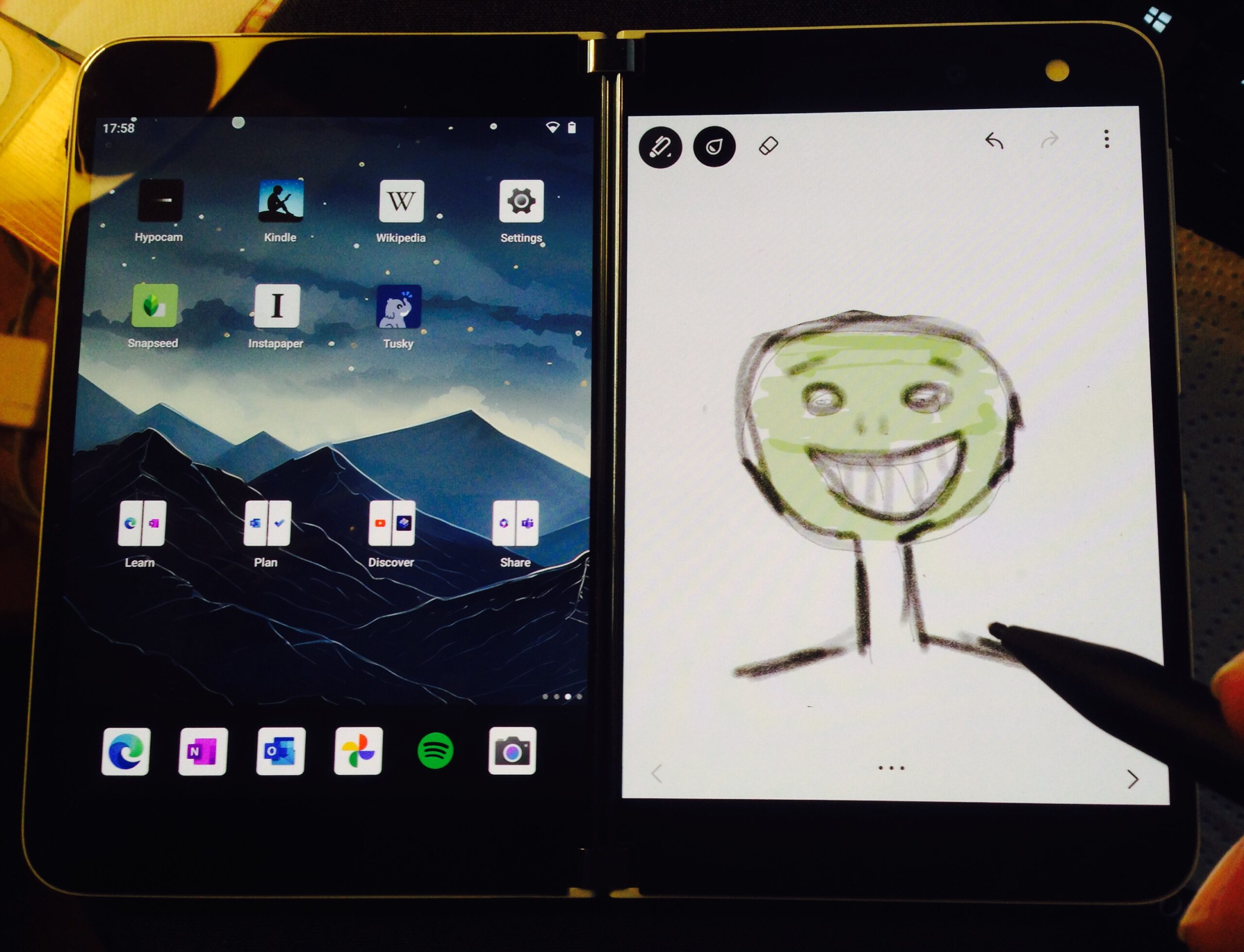

One of my preferred ways to use my Surface Duo — two apps opened side by side.
You can have apps take the entire screen (or rather, the two screens together) — you’ll obviously see the clear separation in the middle. Sometimes it feels better to turn the Surface Duo in portrait orientation — so that the hinge separates the two halves horizontally, have an app take the whole real estate, and scroll vertically. Or you can place the Surface duo in such a way that an app takes one screen in landscape orientation, and the virtual keyboard takes up the other screen. This way, it’s like having a mini-laptop.

What I particularly like about the original Surface Duo is that Microsoft put forward a very opinionated device, with a series of purposeful design choices that made that Duo unique.
- It didn’t have an external display when folded and a bigger unified display when unfolded. But the 360-degree hinge allowed you to fold the Duo in a way that the two screens remained on the outside, so you could switch to single-screen use, as if it were a regular smartphone.
- It ‘owned’ its visible, screen-splitting hinge like iPhones own their notches and islands (at least, that’s what Apple likes to think). The decision not to have a single internal display that folded on itself was bold and did not feel like a compromise. It felt like owning the concept of a digital notebook and not a 2‑in‑1 foldable tablet/smartphone hybrid.
- The de-emphasising of the camera was another bold decision, in a sector where every damn smartphone has its camera system as main selling point and highlight feature. No unsightly ‘camera island’ on the back. No punch-hole camera inside. Because the point of the Surface Duo was being a companion device whose main focus was to be a sort of pocket computer, a sleek, futuristic PDA, not yet another phone that wants to be a professional camera.
The original Surface Duo, in this regard, is the most Apple-like device Microsoft has produced. Conceptually, it’s a device that could have been imagined within Jobs’s Apple (again, I’m talking more about the Surface Duo’s personality rather than its literal design, although the Surface Duo feels much closer to Apple’s Knowledge Navigator concept than the iPhone Duo).
And that’s why it’s such a frustrating pity that Microsoft didn’t believe enough in the Surface Duo to push all these opinionated takes and stress the Duo’s uniqueness. They could have doubled down on the ‘book’ form factor in so many ways. They could have optimised so many parts of its user interface to be interacted with a stylus, just like in the original Courier prototype design. The Surface Duo could have become a sort of modern Apple Newton MessagePad. It could have become what many e‑ink tablets released afterwards have actually become — the digital equivalent of paper notebooks.
Instead, Microsoft treated this potential jewel with the most obtuse inertia. The second iteration, the Surface Duo 2, was bland and unimaginative. People wanted better cameras? Microsoft added just that — an unsightly camera array on the back of the device. It didn’t look like an elegant digital notebook anymore. The 360-degree hinge couldn’t fully reach 360 degrees anymore. The Surface Duo 2 may have featured better hardware underneath. But everything that had felt unique, fresh, and original in the first Duo’s concept had practically been killed.
In comparison, Apple’s new iPhone Duo — as good as the hardware and overall design are — doesn’t really introduce anything new. It’s just another foldable, produced following the guidelines of the many Android foldables that have preceded it. It doesn’t pioneer any new interface paradigm that may hint at innovative new ways to use such a device, or use cases never before seen in the category the iPhone Duo belongs to. It’s another ‘me too’ device of today’s Apple, constantly afflicted with this Fear Of Missing Out.
Pingback: Michael Tsai - Blog - iPhone Duo